Dwa Kolory
A mobile-first redesign for a Ukrainian heritage concept store, built to carry its Instagram-driven traffic straight into an easy shop.
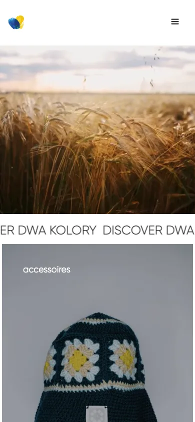
Dwa Kolory sells handmade goods, crochet, embroidery, jewelry, candles, rooted in Ukrainian heritage, and most of its discovery happens on Instagram. Visitors were arriving from a feed built entirely around product photography, on their phones, so the shop needed to match that experience instead of forcing them onto a desktop-first layout.
I rebuilt the site in Webflow with a mobile-first layout: a simple category grid (accessories, clothing, jewelry, candles) up front, each category represented by the same kind of strong product photography the brand already uses on Instagram, and a short path from a product photo to checkout.
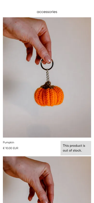
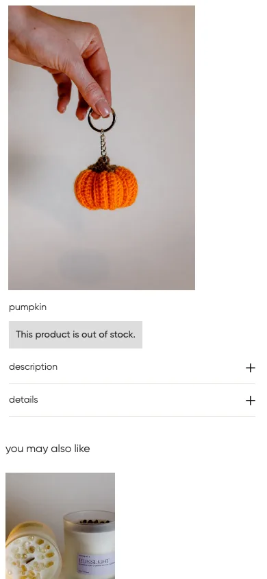
The site is built mobile-first since that's how Dwa Kolory's traffic actually arrives from Instagram, but it holds up on a larger screen too: the stacked mobile category list becomes a proper grid, and the same product page gets more breathing room.
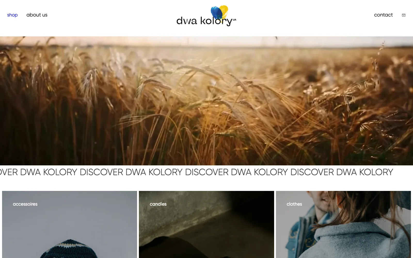
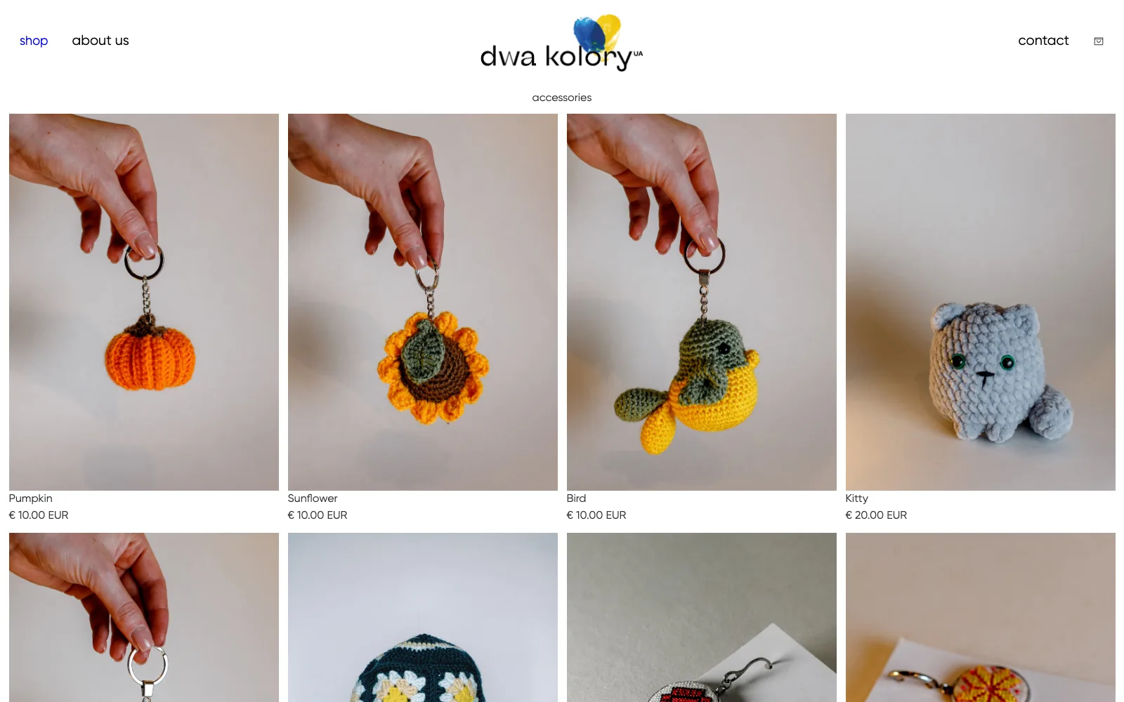
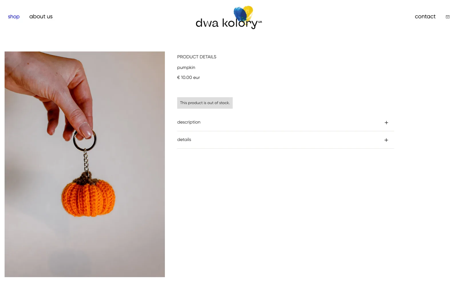
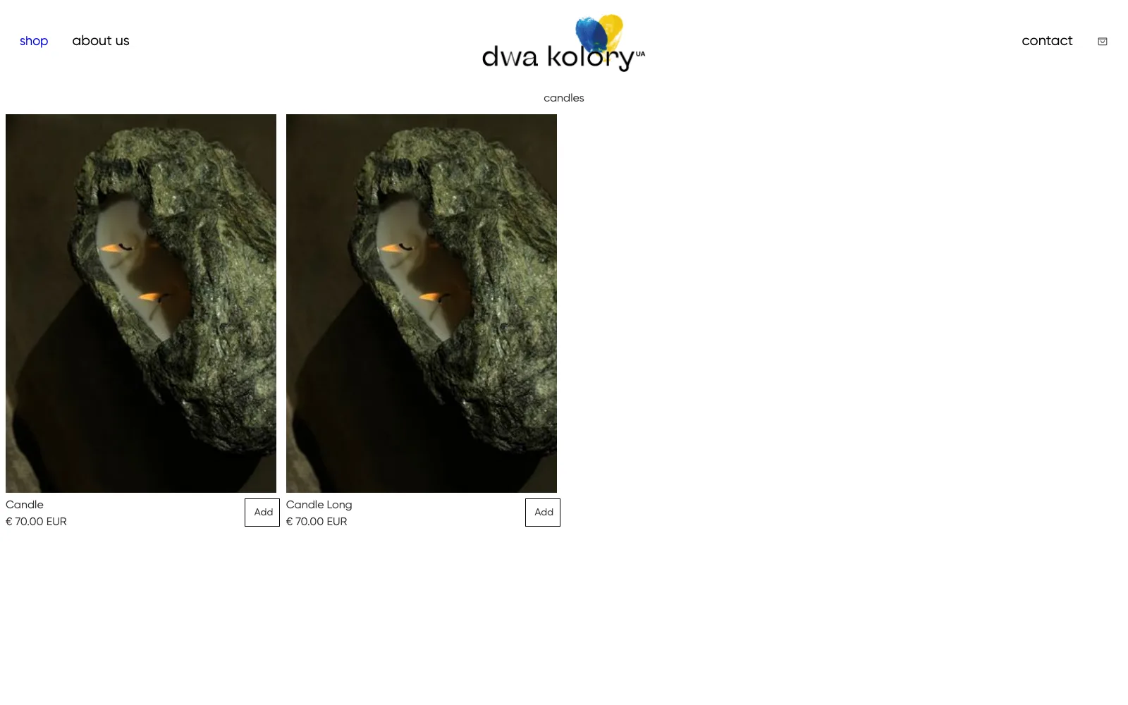
The redesigned store is live at dwakoloryua.com, carrying Dwa Kolory's Instagram-first product photography into a shop that works the way its actual traffic arrives: on mobile.